
How to choose colors for colorwork knitting
The most important step in making a colorwork sweater is choosing the right colors. But how do you know you have the right colors? There is a lot of information about color theory out there so I’m going to try to boil it down for you and leave you with a simple process to follow. I am not an artist and have only a very limited knowledge of color theory. Yet my color combinations are perfectly lovely. Anyone can put together a stunning combination of colors as long as they know just a few things.
First of all, let’s cover some basic definitions. In this post I will talk about color (often called hue) and color value. Color is the shade – green, blue, purple, etc. Color value is the relative strength that color has. Of the two, color and color value, color value is the most important when choosing which colors to put together in your project.
Choosing your palette
For choosing colors, I think you should just pick color combinations that you like. You could dive deep into color theory and complimentary and analogous colors, but I am not well-versed enough to teach those concepts and find that personal taste often overrides these concepts anyway. When I choose a colorwork combination, I simply pick a few colors I like together and never consult a color wheel.
A good way to figure out what color combinations you like is to simply collect images that speak to you. Maybe it is other people’s knitting projects on Instagram or Pinterest. Maybe a particular art piece. Or, my favorite, color combinations found in the natural world around you. You can save these images in a Pinterest board, Instagram, or in a file on your phone. Then, once you have your inspiration file put together, you can pull your favorite color combinations from it.
If you need inspiration for a particular knit, check out the project page for that pattern on Ravelry. Different people have different attitudes towards color. I would never think of putting purple and yellow together, but some people have, and it looks amazing. Seeing the colors other knitters chose to work with can give you an idea of what colors to choose for your own project.
Color value and how to use it
Color value is simply the relative strength of the color. Sometimes it is easy to eyeball like when you are choosing dark and light colors to contrast with each other. But sometimes it can be very hard to determine. However, most of us carry around a handy little tool in our pocket that can very easily show us what the color values are. Pull out your phone, snap a quick picture, and convert it to black and white. The color value of the yarns will show up as shades of gray from light to dark.
If you are shopping in a yarn store, it is very easy to take a quick picture to compare color value. If you are shopping online, consider emailing the yarn store and asking them to send you a photo of the color combination (or combinations) you are considering. You can then clearly see how the colors play together and convert the picture to black and white to see the color value.
You are looking for colors that have a noticeably different color value. Having your colors be a drastically different hue, but the same color value will give you muddy and indistinguishable colorwork. See these two yarns pictured below? The orange and brown are very different colors in terms of hue, but a quick look at the black and white comparison shows that they are the same color value. Putting these two colors together in colorwork would not look good at all.

Orange and brown are very different hues, but the color values of these two yarns is the same.
Compare instead the colors I chose for Cedar in the photo below. In the black and white photo, you can clearly see that they are three different color values from light to dark. The gray is light, the caramel is medium, and the green is dark. This means that the colors will contrast with each other enough to make the colorwork motifs clearly distinguishable. Even though the caramel and green colors don’t touch each other in the design, it is still important to have them be different color values. This makes for a much more pleasing effect in the end.

Light, medium, and dark color values make for a winning color combination.
Choosing colors for a two-color project
If you are choosing colors for a design that only uses two colors, simply choose two colors that have different color values. You can choose colors from across the color wheel (purple and yellow) or colors in the same color family (medium blue and light blue). Whatever color combination you choose, just make sure the colors have different color values or the colorwork will be blurry.
The amount of contrast between color values is also important to consider. Choosing colors with light and medium color values (medium blue and light blue) will give you a lower contrast look. Choosing colors of light and dark color values (navy blue and white) will give you a high contrast look. Either is perfectly fine as long as the two colors you choose have different color values. The one you choose is entirely down to your personal preference. Think about the colorwork sweaters you admire. Do they have a high contrast look or are they more muted?

Blizzard uses a high contrast color combination with a dark brown and white.
Choosing colors for a three-color project
When choosing colors for a design that uses three colors, make sure you have a light, medium, and dark. After that, you can go wild. Choose a monochromatic color palette (light pink, medium pink, red) or something with very high contrast (yellow, coral, aqua).
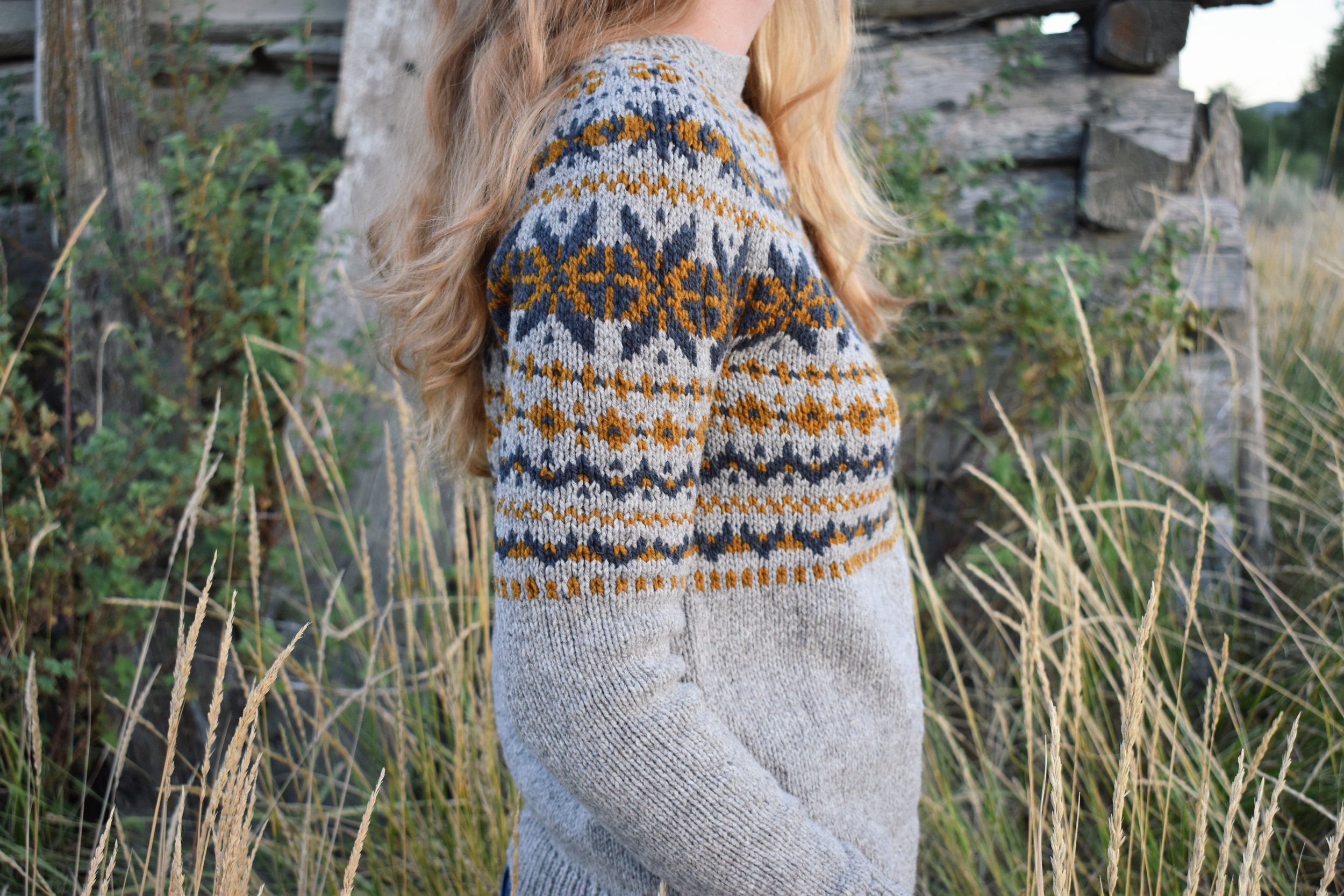
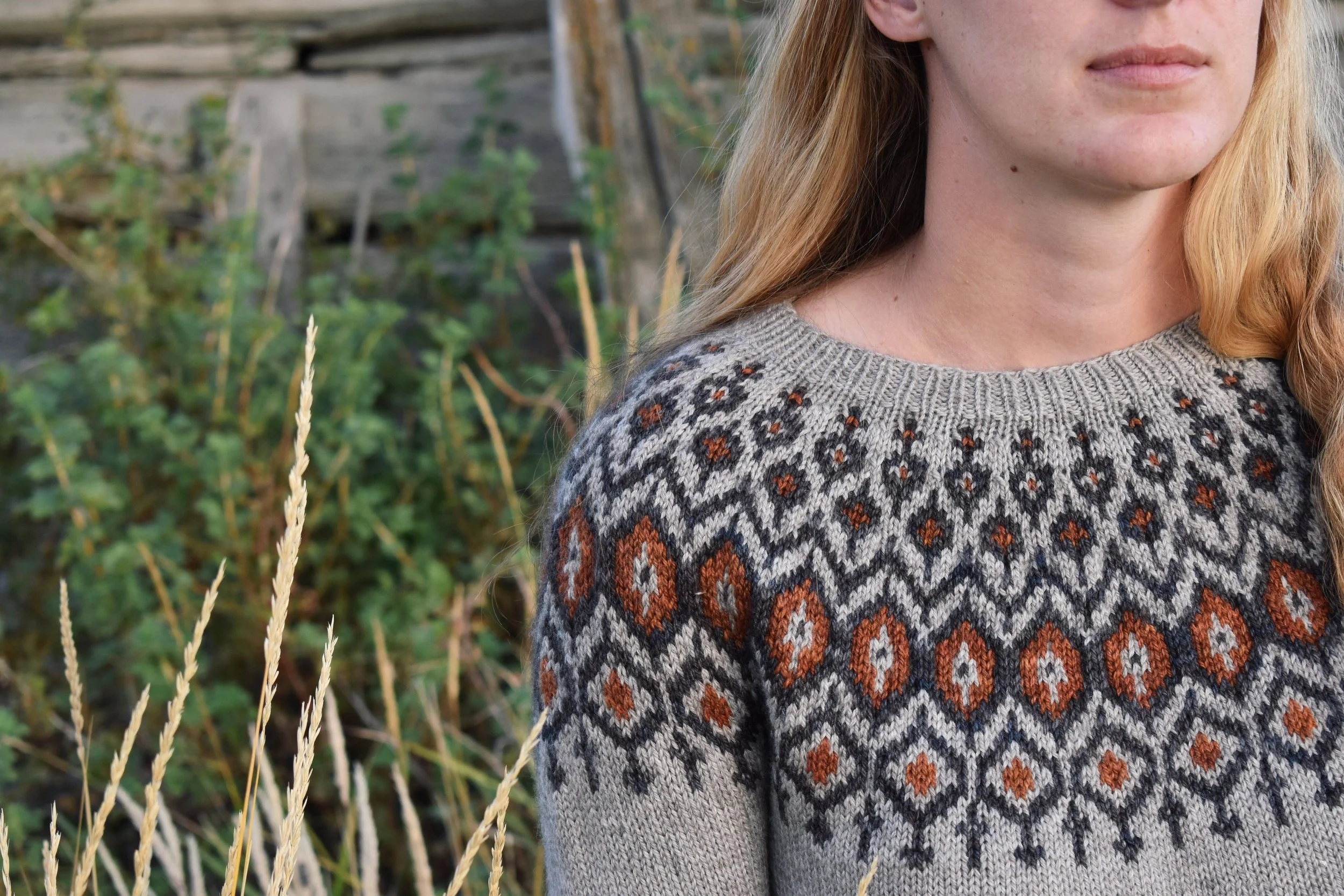
One of my failproof ways to put three colors together is to choose a neutral (always gray for me) for my light and dark, and then choose a bright pop of color for my medium. I used this strategy in both my Ruska and Cinder patterns (pictured below). It always looks amazing and is incredibly easy to put together.
In summary, make sure the colors you are putting together have different color values. After that, just choose whatever color combination you think is beautiful!
Do you want to learn how to knit colorwork?
Check out my in-depth video tutorial I made specifically for people who have no colorwork experience and want to learn how to knit it. Just click on the video below to watch it. The pattern for Blizzard will be released on January 24th.